The receipt? Let's leave it in the past.
As we grow, the things that matter become countless—partly because responsibilities grow with us, and partly because our perspective on the world begins to change. If there’s one thing that never changes, though, it’s the innate human ability to forget those important things: birthdays, deadlines, that one item you needed from the supermarket, the receipt for warranties, and (as we unfortunately know all too well) our planet.
The team at Recivu knows this well, and that’s exactly where their project begins.
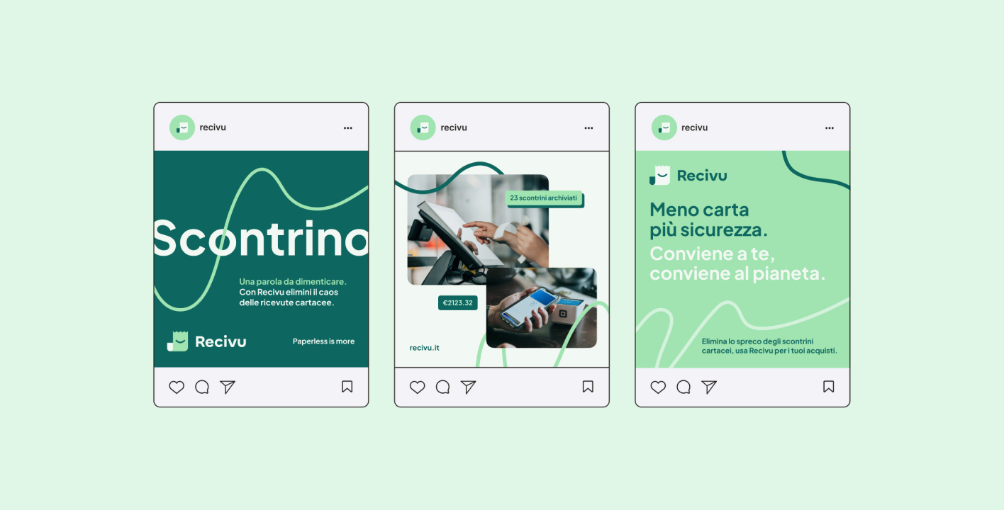
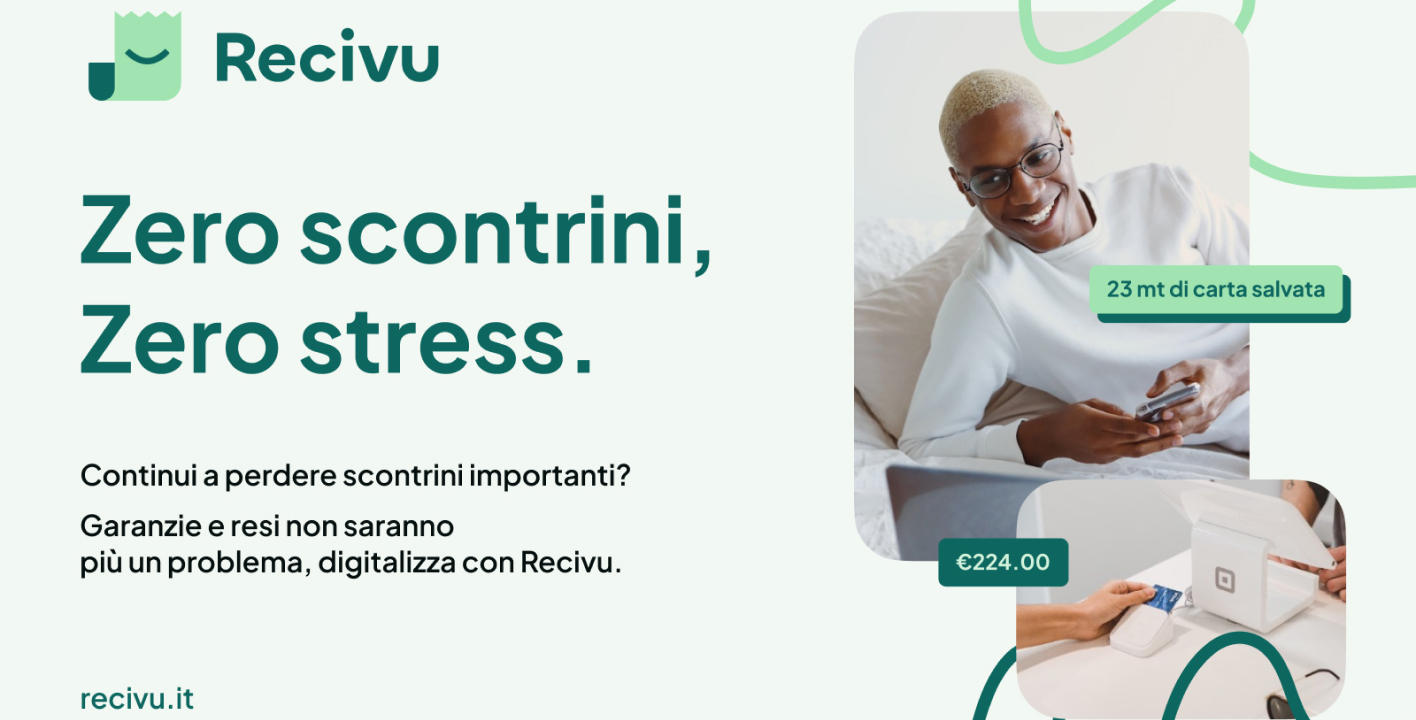
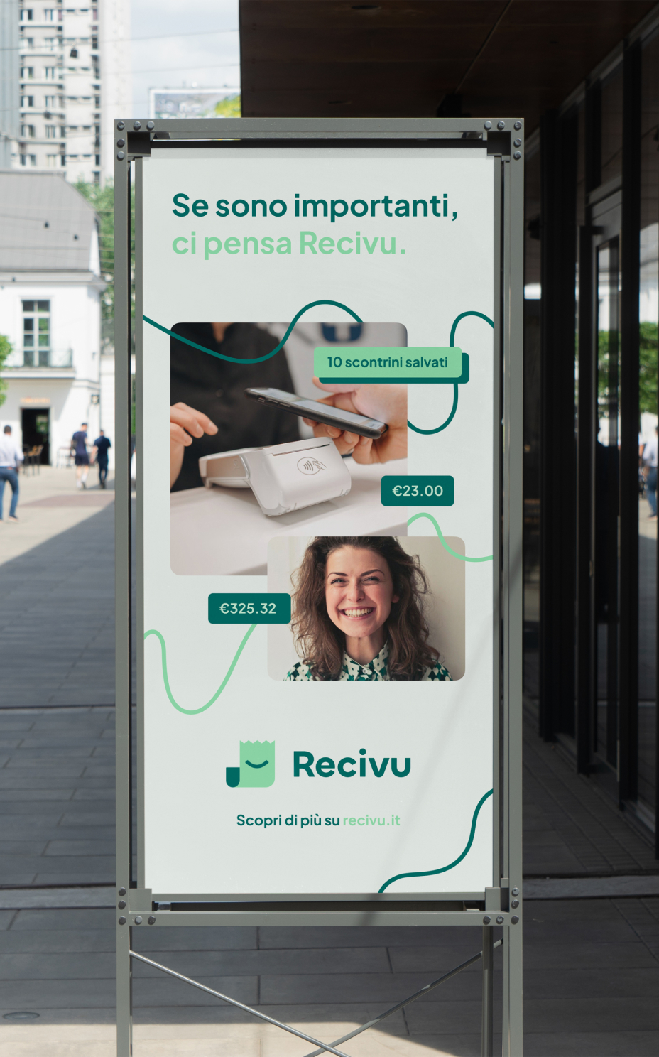
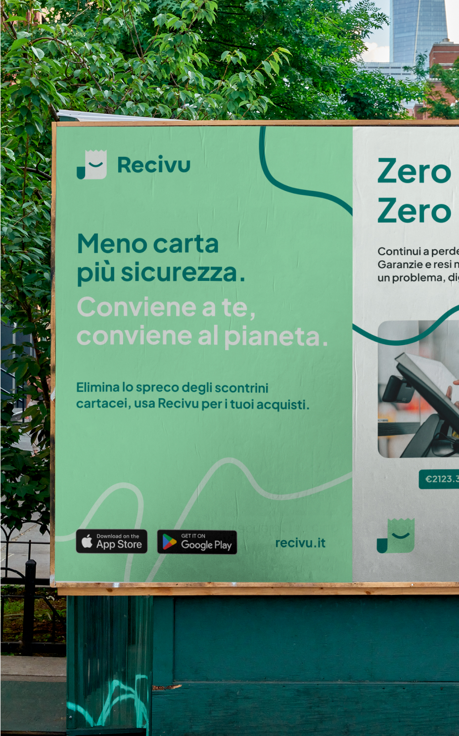
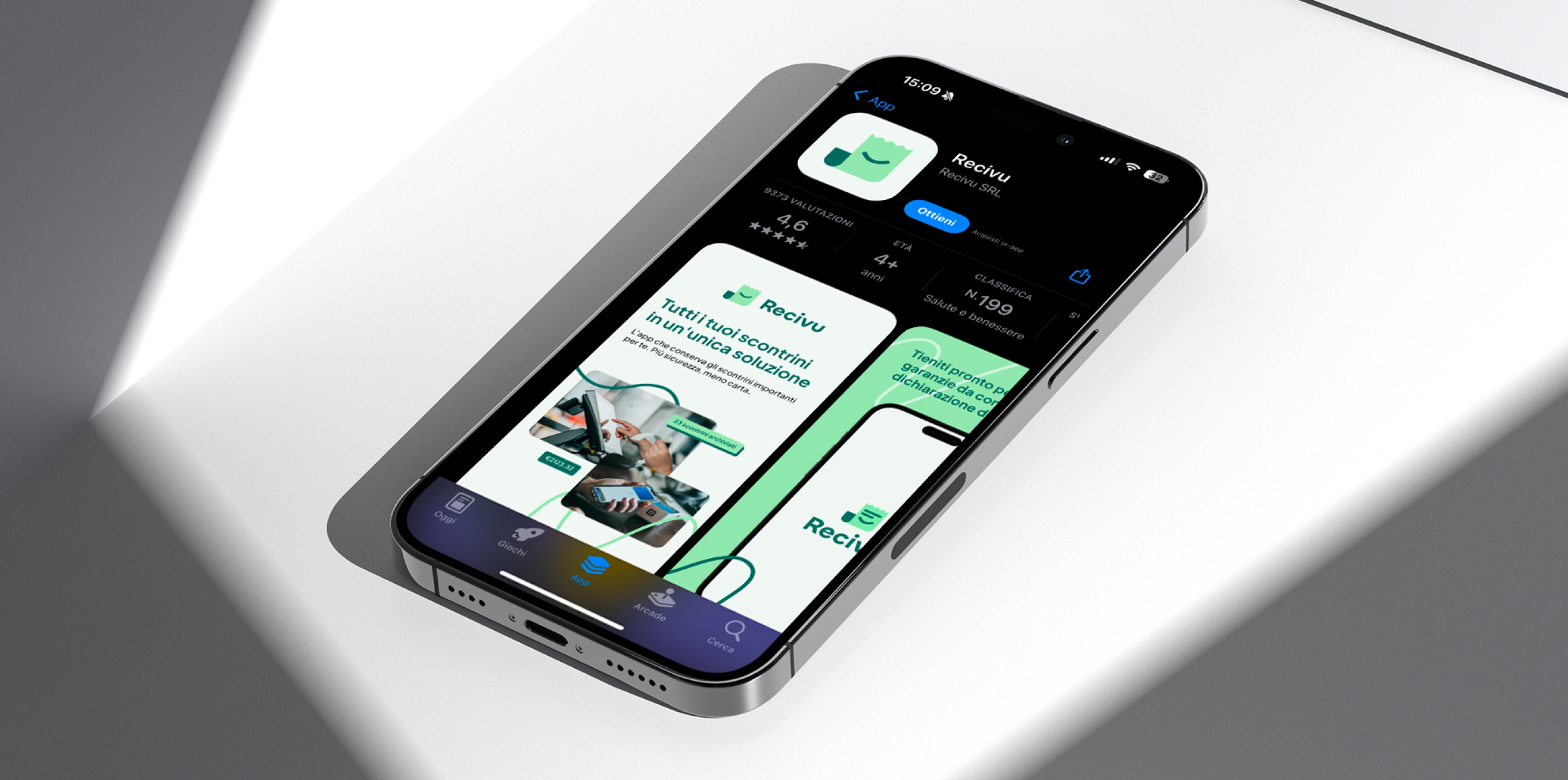
A young and ambitious initiative designed to organize all those receipts that, no matter how important, inevitably end up scattered in bags and pockets—or worse, on the ground. "Paperless is more" is their tagline, and who could argue with that? The idea is brilliant. So brilliant, in fact, that when Recivu participated in the Climatico Contest in collaboration with Siamo Dieci, we were completely dazzled.
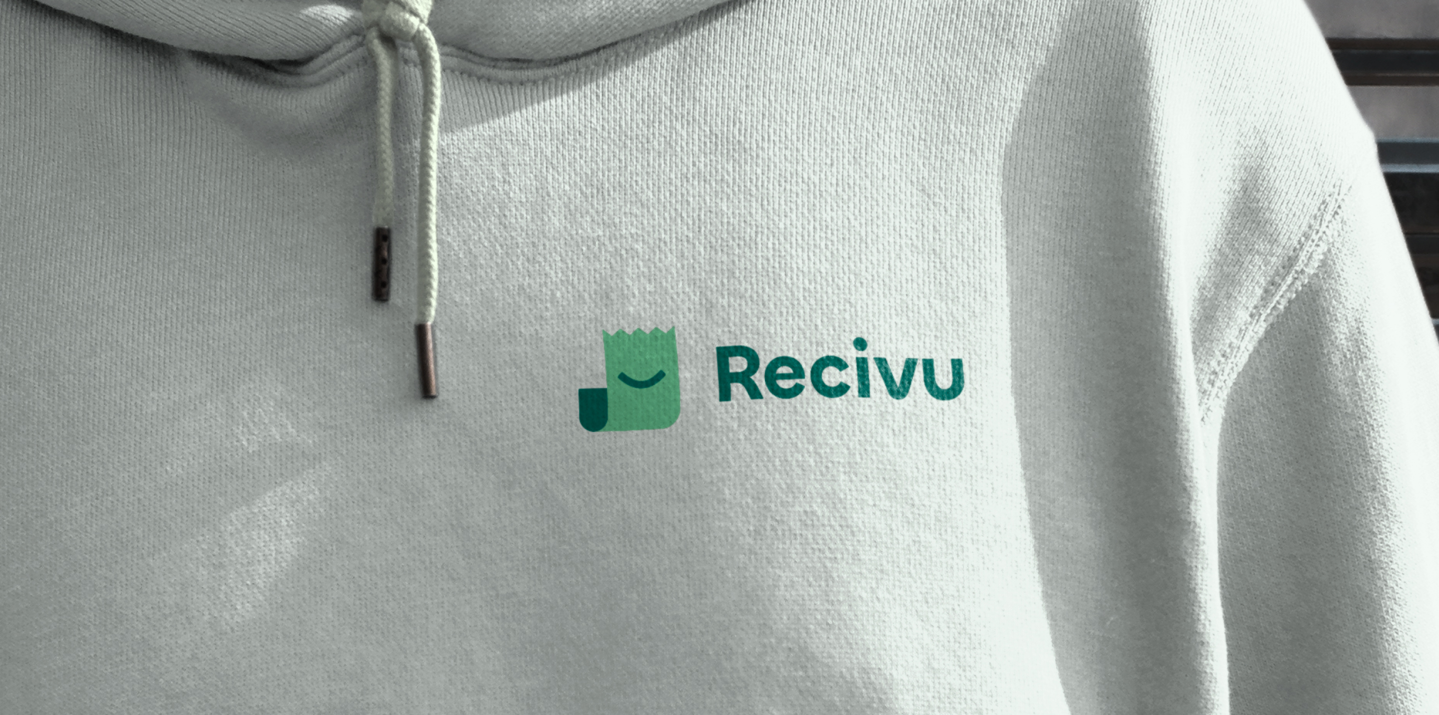
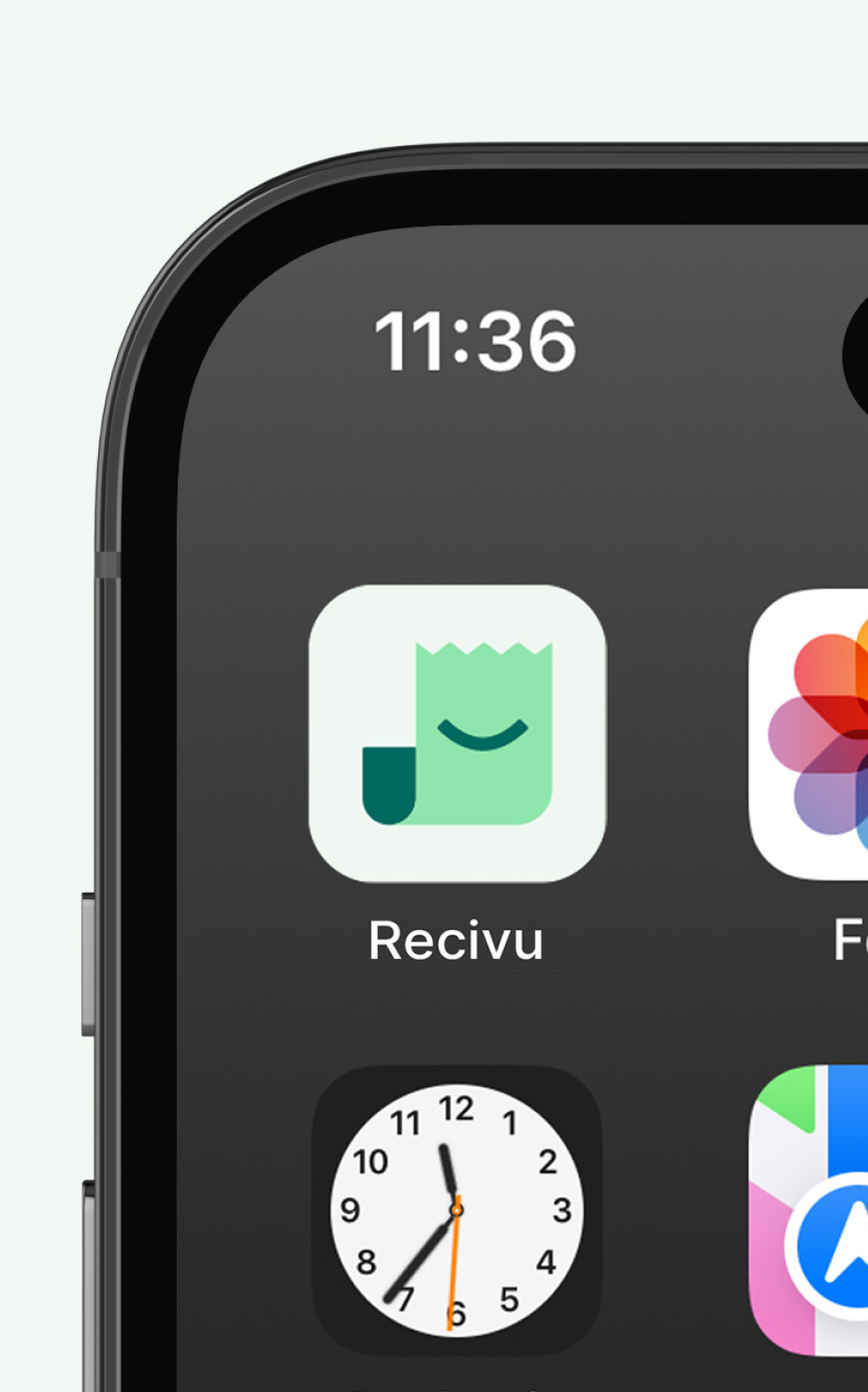
From our very first conversation with the team, we knew that at least a little of their charisma and reliability had to come through in their brand. We immediately got to work updating and transforming the logo while keeping its signature green—already a defining element of Recivu. Our goal was to create a visual identity that could become unique and instantly recognizable over time, and through the logo mascot, we successfully conveyed the sense of security and trust that the founders wanted to project to their audience.
The logo was paired with a color palette that starts from green and expands into softer shades, along with colored graphic lines reminiscent of receipt folds, perfectly complementing a photographic language that is lighthearted yet informative. Just like in school, when we highlighted important notes with a marker, we decided to highlight Recivu’s identity—making it familiar and instantly recognizable, impossible to forget.
Unlike the receipt for my old TV warranty—who knows where that ended up?
Good thing Recivu is here now.