In the future of payments, all it takes is a tap.
The biggest changes always start with small gestures, just like that of a Tap.
We jumped on board this project with enthusiasm, searching for the perfect way to embark on a journey toward a story that is original, dynamic, and engaging.
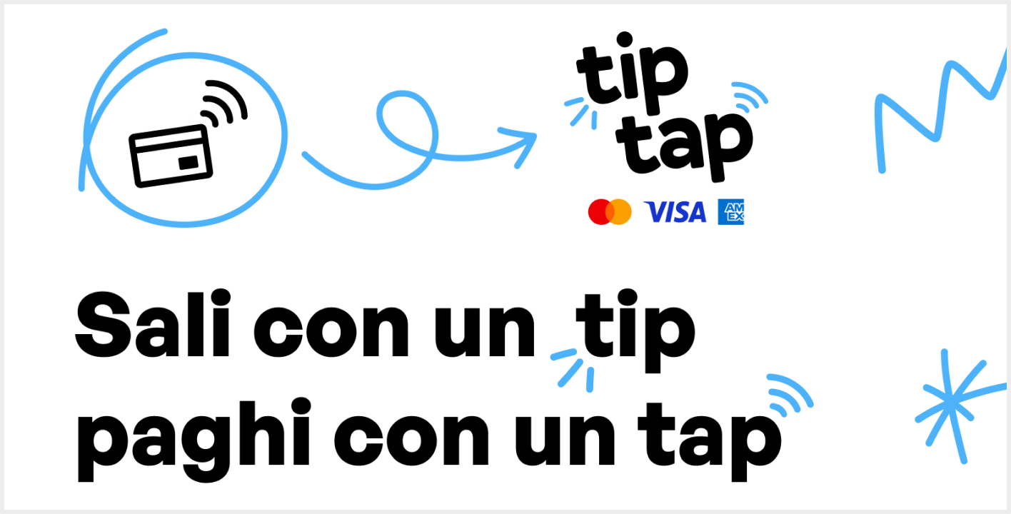
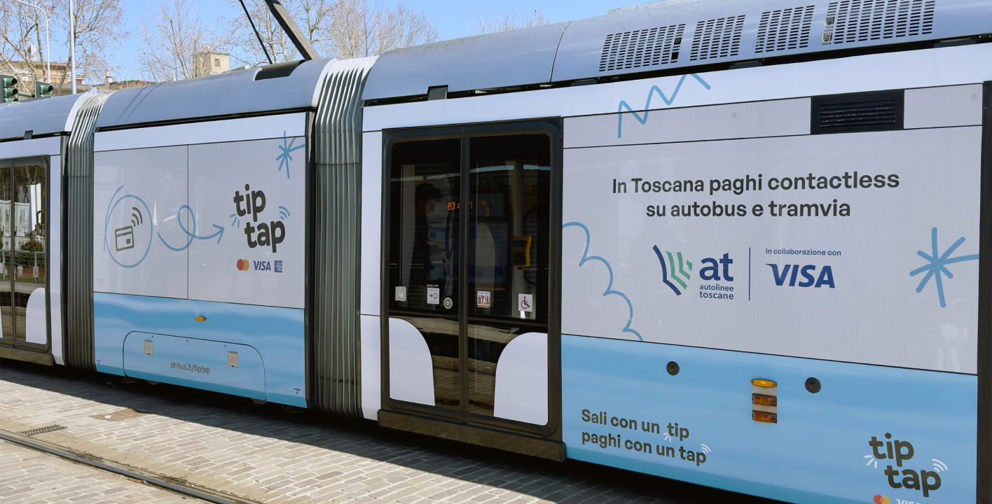
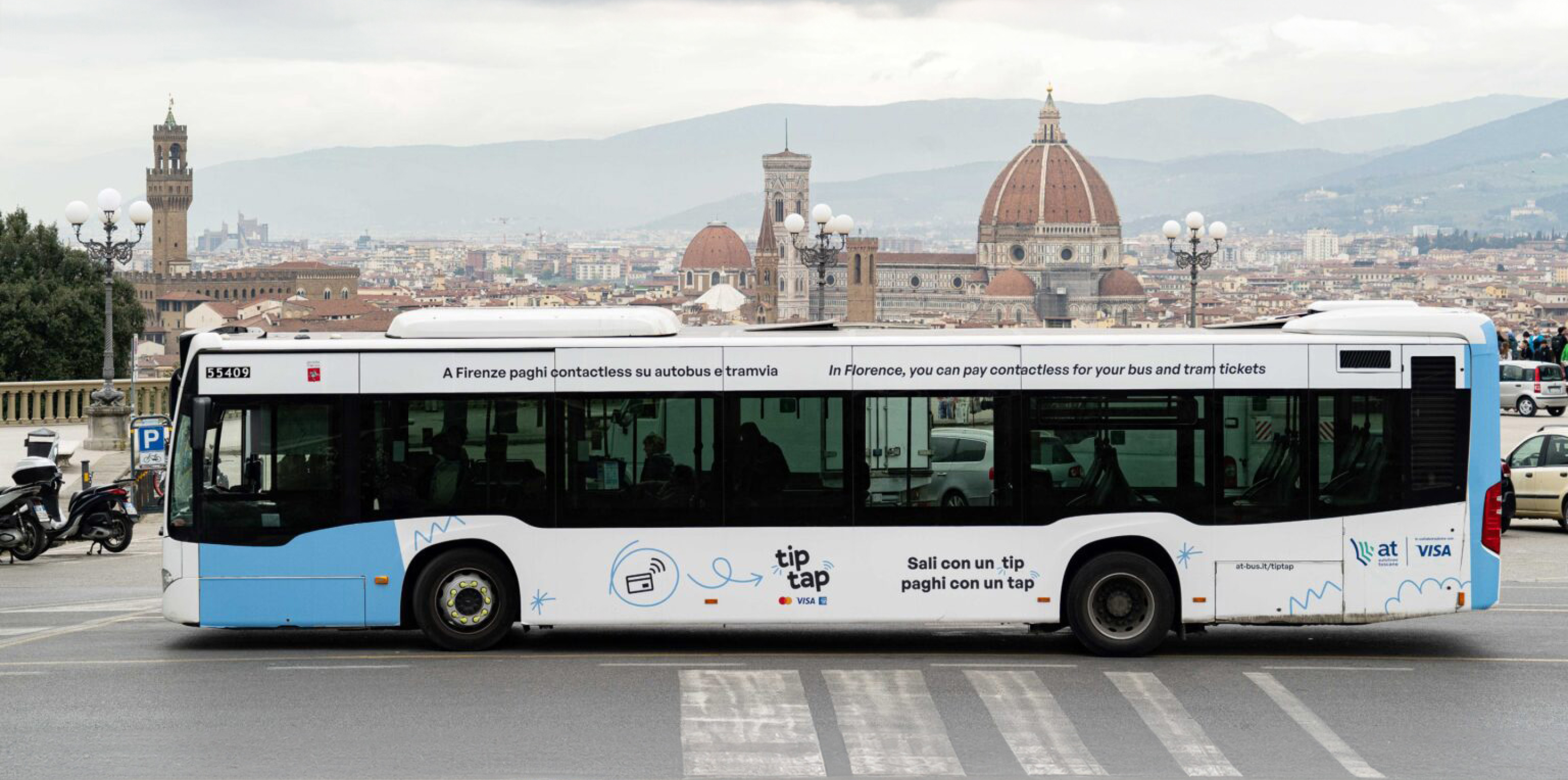
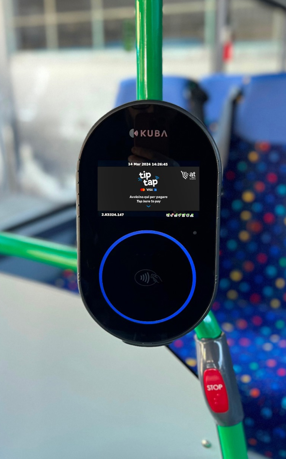
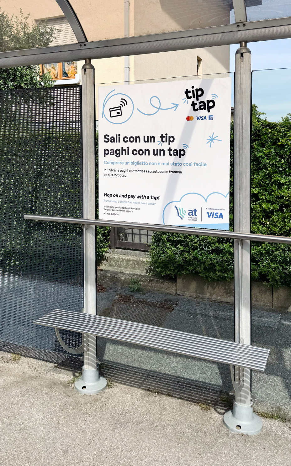
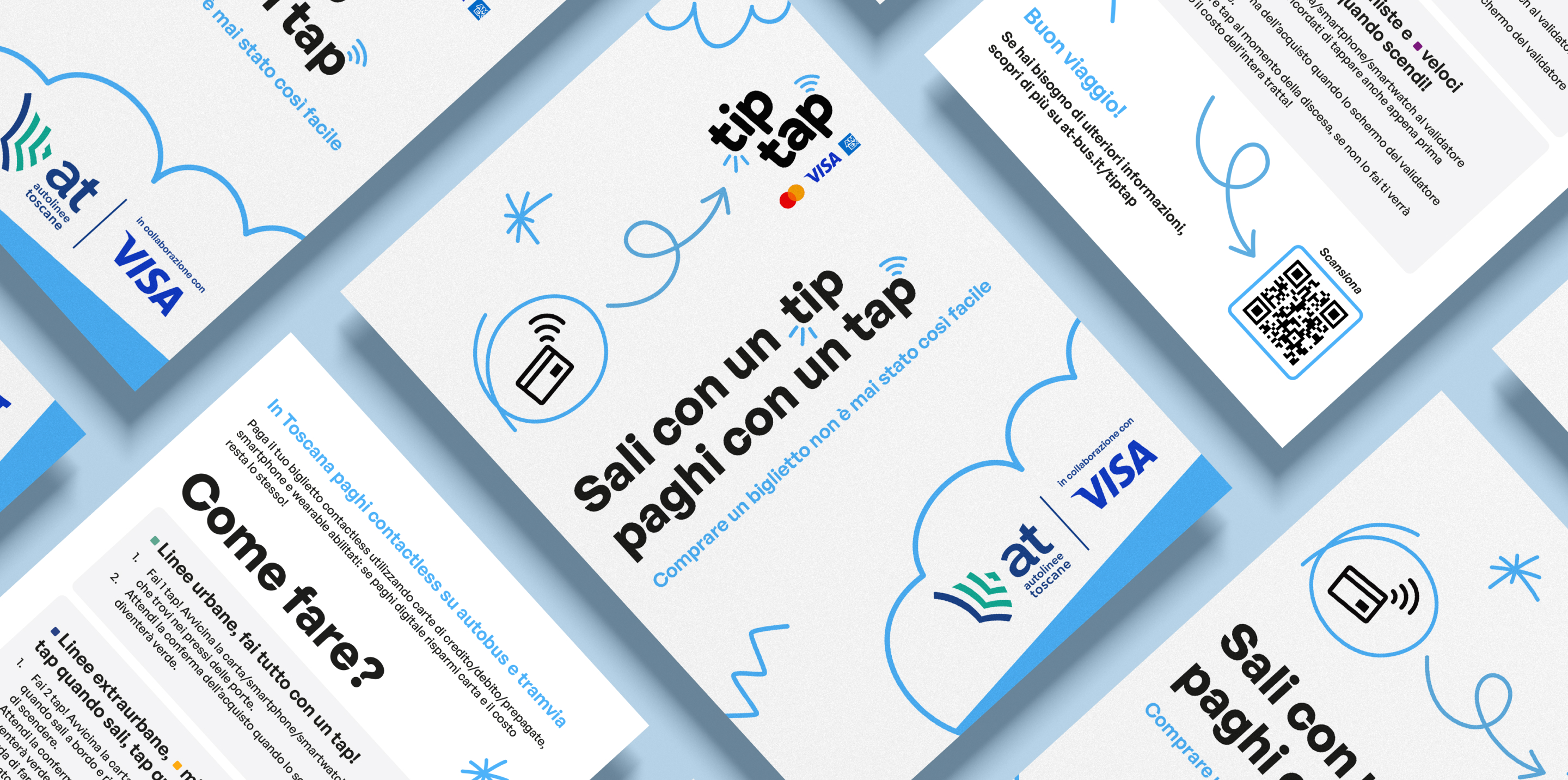
Tip Tap is the new contactless payment service for public transport introduced by Autolinee Toscane in collaboration with Visa. An innovative ticketing method that has made Tuscany a pioneer in digital payments for public mobility.
Thanks to our collaboration with TheSnaps, we met Autolinee Toscane—the operator managing the entire public transport network of buses and trams across Tuscany—at the very beginning of its journey, just as it was looking for the perfect fit to set off on its path. A modern identity that would appeal to tech-savvy young users eager for innovation, while also instilling trust in a broader audience less accustomed to digital payments.
This marked the start of an in-depth phase of research and experimentation, drawing inspiration from the Anglo-Saxon landscape. The goal was to give Tip Tap a reliable and youthful look, steering away from traditional institutional tones. The result is a bold and innovative visual identity, featuring a playful logo that echoes the musicality of the brand’s tagline and the immediacy of contactless payments. The color palette—built around white, black, and blue as the accent color—was chosen to inspire trust while adding dynamism and vibrancy to the design.
Recognition, dynamism, and freshness were the guiding principles behind Tip Tap’s branding. A modern visual identity that conveys the full power of an action as simple as it is innovative—just like a tap: a gesture capable of changing everything, even revolutionizing the world of public transport.